This is the latest piece from Aitor Azkue. If you don´t recall the name you´ll may want to check his "Never Ending History?" here, you most likely remember it.
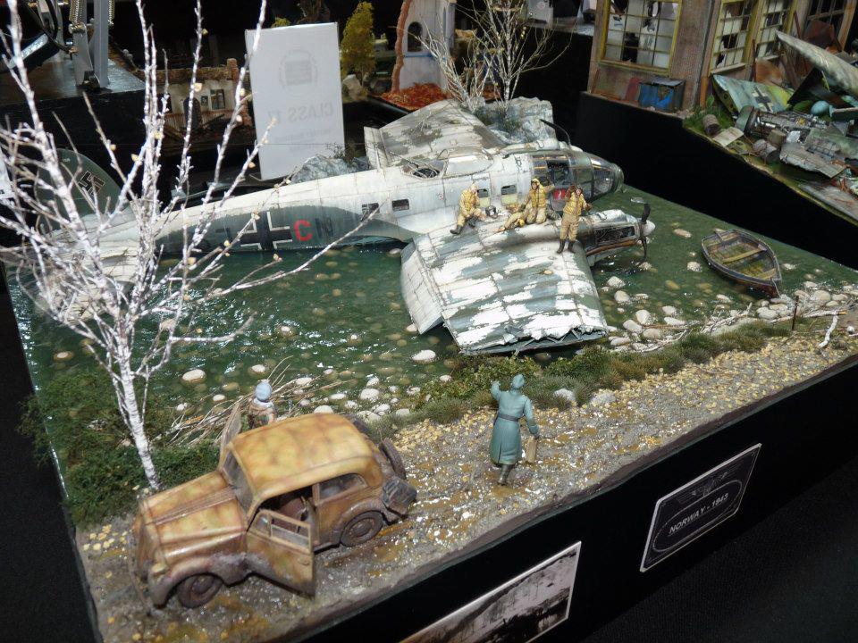
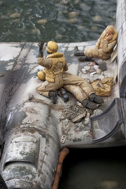
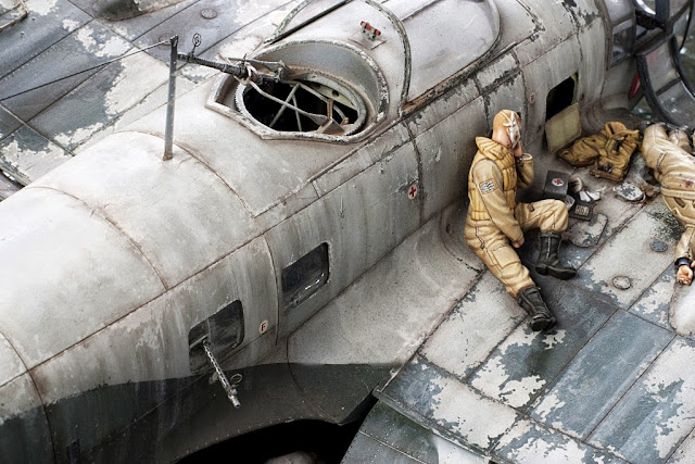
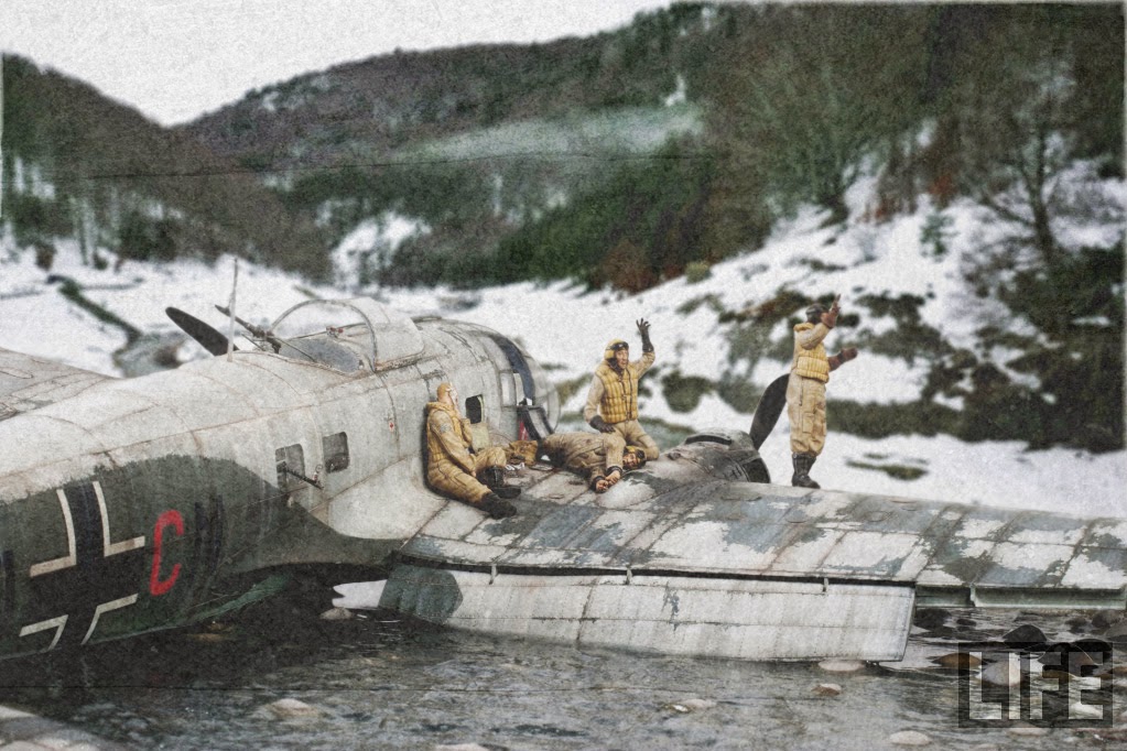
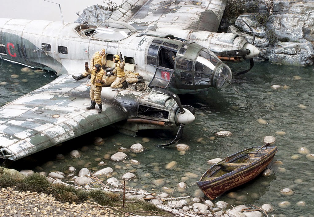
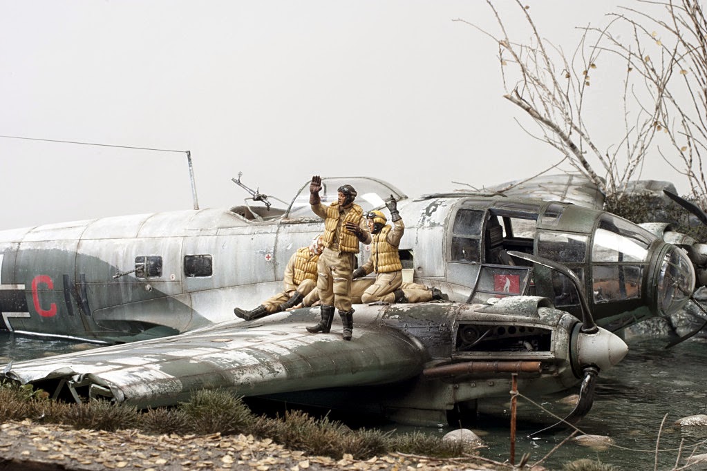
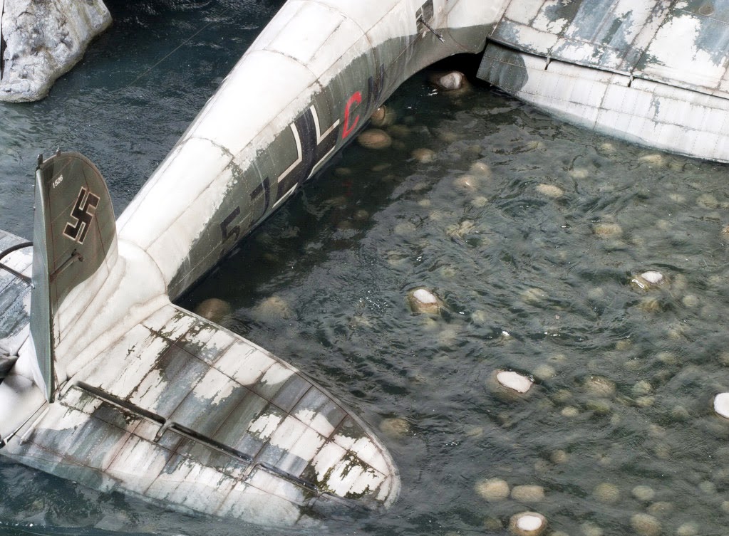
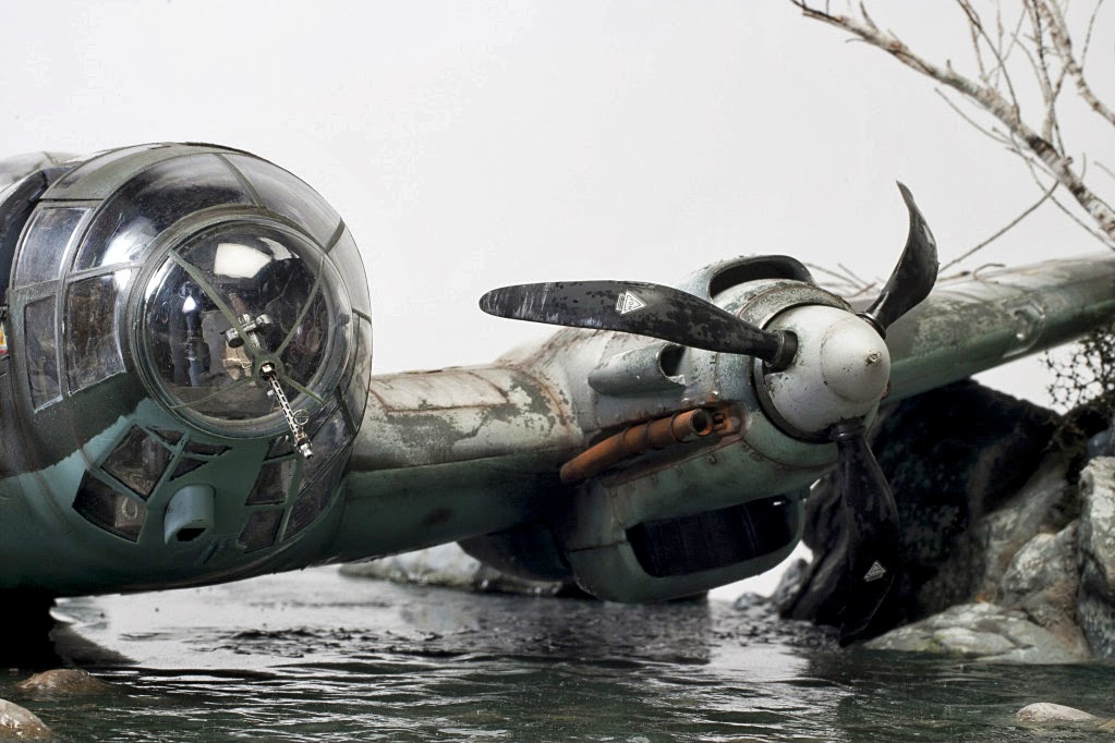
With this work Aitor bring us a dramatic sight of the most bitter side of aviation. As usual in his latest works the central scene attracts immediately the viewer attention making us to focus in the story. From there we can begin a voyage around the surrounding background just to check the amazing level of detail and realism that enhance the emotion of the message. Aitor is a diorama artist that transcends the mere standards of technical skills in modelling and composition and search a way to touch the spectator. An artist in all the extension of the word (a not enough valued modeller in my opinion, but certainly he will be).
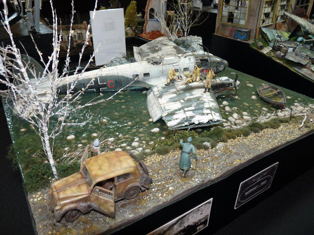
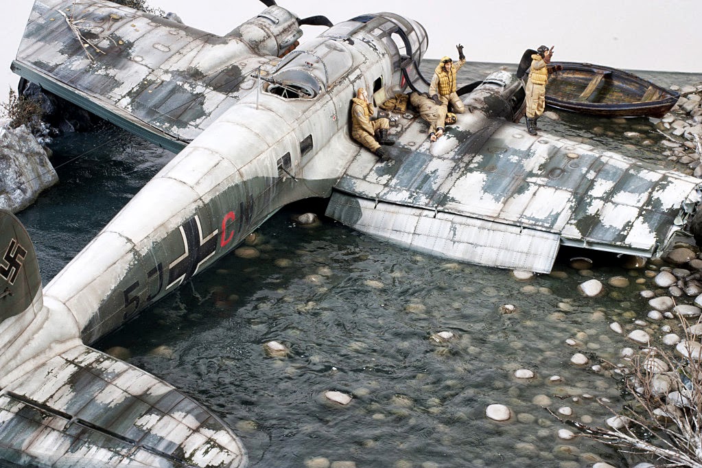
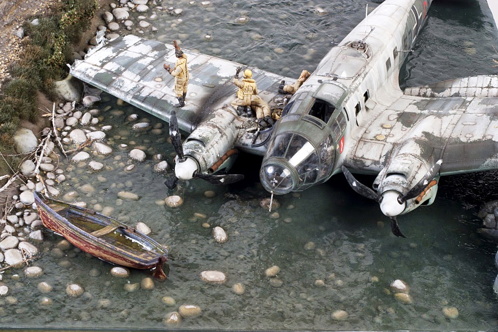
Just a thought about one of my favourite elements, the derelict skiff or, as I like to say, the oblivion boat. Why is it there? Is only an element for filling an empty angle? It has some significance? Well, everyone can make his guess but personally I think it is a sour metaphor about the doom of the crashed bird and maybe of the wounded crewmen as well.
It is hard to be original in the qualification of these kind of works; Aitor always makes me to improve my English vocabulary. What about delightful?
I hope this Norway bitter scene moves you as much as it moved me.
Q

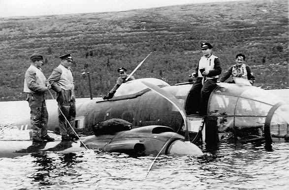
The inception:


The culmination:


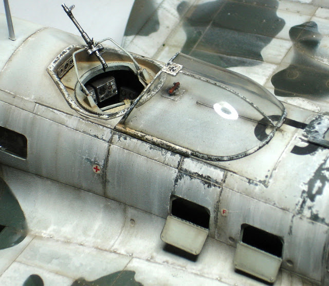

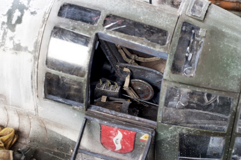
An example of the interior detailing:


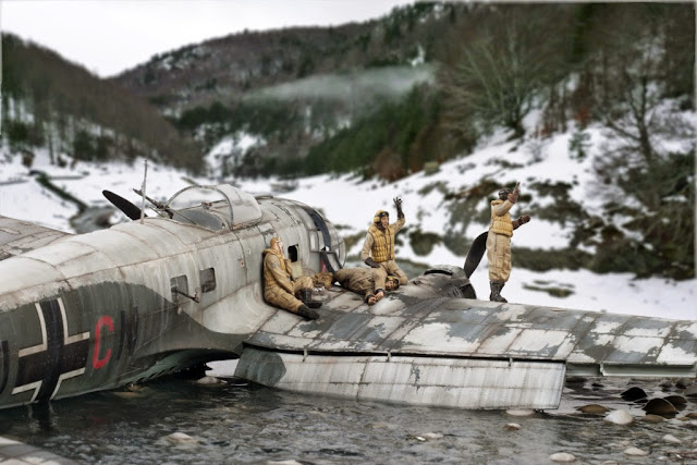
Here a few shots with a warmer illumination. As you can see it looks awesome as well:
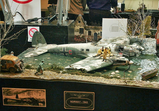


With this work Aitor bring us a dramatic sight of the most bitter side of aviation. As usual in his latest works the central scene attracts immediately the viewer attention making us to focus in the story. From there we can begin a voyage around the surrounding background just to check the amazing level of detail and realism that enhance the emotion of the message. Aitor is a diorama artist that transcends the mere standards of technical skills in modelling and composition and search a way to touch the spectator. An artist in all the extension of the word (a not enough valued modeller in my opinion, but certainly he will be).
Just a thought about one of my favourite elements, the derelict skiff or, as I like to say, the oblivion boat. Why is it there? Is only an element for filling an empty angle? It has some significance? Well, everyone can make his guess but personally I think it is a sour metaphor about the doom of the crashed bird and maybe of the wounded crewmen as well.
It is hard to be original in the qualification of these kind of works; Aitor always makes me to improve my English vocabulary. What about delightful?
I hope this Norway bitter scene moves you as much as it moved me.
Q
The inception:

The culmination:


An example of the interior detailing:


Here a few shots with a warmer illumination. As you can see it looks awesome as well: